CSS оформление для страниц с анкетами
/* ============================================
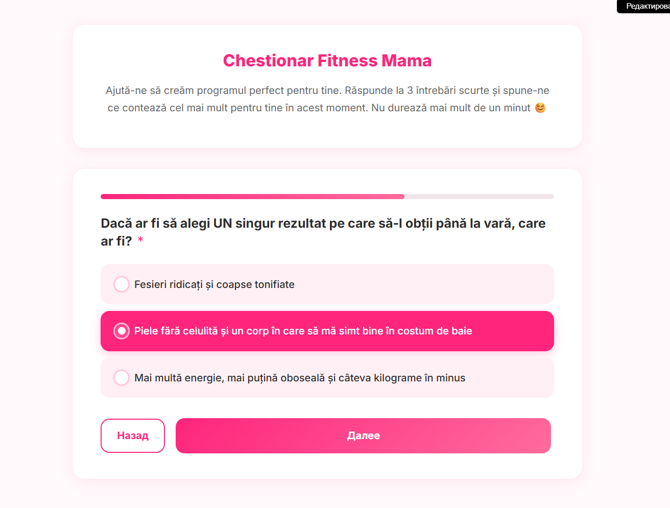
Fitness Mama — Chestionar Postură & Sănătatea Spatelui
CSS for GetCourse Singly (sequential) Survey
Quiz-style — UNIVERSAL version (no hardcoded IDs)
============================================ */
/* --- 1. @import Inter --- */
@import url('https://fonts.googleapis.com/css2?family=Inter:wght@400;500;600;700;800&display=swap');
/* --- 2. CSS Custom Properties --- */
:root {
--accent: #ff257c;
--accent-light: #fff0f5;
--accent-gradient: linear-gradient(135deg, #ff257c, #ff6b9d);
--bg: #fff9fb;
--bg-card: #ffffff;
--text: #2d2d2d;
--text-muted: #666;
--shadow-card: 0 4px 20px rgba(255, 37, 124, 0.08);
--border-card: 1px solid rgba(255, 37, 124, 0.1);
--radius-card: 20px;
--radius-field: 14px;
--transition: 0.3s ease;
}
/* --- 3. Base styles --- */
*,
*::before,
*::after {
box-sizing: border-box;
}
body {
font-family: 'Inter', -apple-system, BlinkMacSystemFont, 'Segoe UI', sans-serif !important;
background: var(--bg) !important;
color: var(--text);
line-height: 1.6;
-webkit-font-smoothing: antialiased;
-moz-osx-font-smoothing: grayscale;
}
/* --- 4. Hide GC service elements --- */
.add-redesign-subblock,
.common-setting-link,
.showAllCustomFields,
.survey .text-right {
display: none !important;
width: 0 !important;
height: 0 !important;
overflow: hidden !important;
position: absolute !important;
pointer-events: none !important;
}
.custom-form.without-help-elems {
padding: 0;
}
.builder-item .hidden {
display: none !important;
}
/* --- 5. Generic content/text blocks above the form --- */
/* Targets any lt-block that contains a header + text (intro block) */
.survey-page .lt-block-wrapper,
[class*="ltBlock"] .lt-block-wrapper {
font-family: 'Inter', sans-serif;
}
/* Card-style wrapper for any modal-block-content */
.modal-block-content {
background: var(--bg-card);
border-radius: var(--radius-card);
box-shadow: var(--shadow-card);
border: var(--border-card);
padding: 28px 20px !important;
}
/* Headers inside content blocks */
.modal-block-content .f-header-36,
.modal-block-content .f-header {
font-family: 'Inter', sans-serif !important;
font-size: 22px !important;
font-weight: 800 !important;
color: var(--accent) !important;
line-height: 1.3 !important;
margin-bottom: 16px;
text-align: center;
}
.modal-block-content .f-header-36 p,
.modal-block-content .f-header p {
margin: 0;
}
/* Body text inside content blocks */
.modal-block-content .f-text,
.modal-block-content .text-normal,
.modal-block-content .text-large {
font-family: 'Inter', sans-serif !important;
font-size: 15px;
line-height: 1.7;
color: var(--text-muted);
}
.modal-block-content .f-text p {
margin-bottom: 0.6em;
}
/* --- 6. Form container block --- */
.lt-form .lt-block-wrapper {
padding-top: 10px !important;
padding-bottom: 40px !important;
}
/* --- 7. Progress bar --- */
.progress-bar-wrapper {
height: 8px;
background: #f0e6ea;
border-radius: 4px;
overflow: hidden;
margin-bottom: 24px;
}
.progress-bar-wrapper .progress-bar {
height: 100% !important;
background: var(--accent-gradient) !important;
border-radius: 4px;
transition: width 0.4s ease;
float: none !important;
box-shadow: none !important;
font-size: 0 !important;
line-height: 0 !important;
padding: 0 !important;
}
/* --- 8. Section headers (empty field-input-block) --- */
.field-wrapper:has(.type-select .field-input-block:empty) {
margin-top: 8px;
margin-bottom: 8px;
border-bottom: none;
padding-bottom: 0;
}
.field-wrapper:has(.type-select .field-input-block:empty) .field-label {
display: block;
font-family: 'Inter', sans-serif !important;
font-size: 11px !important;
font-weight: 700 !important;
color: var(--accent) !important;
text-transform: uppercase;
letter-spacing: 1.5px;
margin-bottom: 6px;
background: transparent !important;
padding: 0 !important;
border-radius: 0 !important;
}
.field-wrapper:has(.type-select .field-input-block:empty) .field-label .label-value {
color: var(--accent) !important;
}
.field-wrapper:has(.type-select .field-input-block:empty) .field-label .required-sign {
display: none;
}
/* --- 9. Field labels (questions) --- */
.fields .field-label {
font-family: 'Inter', sans-serif !important;
font-weight: 700 !important;
font-size: 20px !important;
color: var(--text) !important;
margin-bottom: 22px;
display: block;
line-height: 1.4;
}
.fields .field-label .required-sign {
color: var(--accent);
margin-left: 3px;
font-weight: 400;
}
/* --- 10. Radio buttons — card style --- */
/* Hide native radio inputs */
.type-select .field-input-block label input[type="radio"] {
position: absolute !important;
opacity: 0 !important;
width: 1px !important;
height: 1px !important;
margin: -1px !important;
padding: 0 !important;
overflow: hidden !important;
clip: rect(0, 0, 0, 0) !important;
white-space: nowrap !important;
border: 0 !important;
pointer-events: none;
}
/* Card style for radio labels */
.type-select .field-input-block label {
display: block !important;
position: relative !important;
background: var(--accent-light) !important;
border: 2px solid transparent !important;
border-radius: var(--radius-field) !important;
padding: 16px 24px 16px 62px !important;
margin-bottom: 10px !important;
margin-left: 0 !important;
margin-right: 0 !important;
cursor: pointer;
font-family: 'Inter', sans-serif !important;
font-size: 15px !important;
font-weight: 500 !important;
color: var(--text) !important;
line-height: 1.5 !important;
transition: all var(--transition);
min-height: 0 !important;
}
.type-select .field-input-block label:last-child {
margin-bottom: 0 !important;
}
/* Radio outer ring (::before) */
.type-select .field-input-block label::before {
content: '' !important;
display: block !important;
position: absolute !important;
left: 18px;
top: 50%;
transform: translateY(-50%);
width: 26px;
height: 26px;
border-radius: 50%;
border: 2.5px solid rgba(255, 37, 124, 0.25);
background: #fff;
transition: all var(--transition);
box-shadow: 0 1px 4px rgba(255, 37, 124, 0.08);
}
/* Radio inner dot (::after) */
.type-select .field-input-block label::after {
content: '' !important;
display: block !important;
position: absolute !important;
left: 25px;
top: 50%;
transform: translateY(-50%) scale(0);
width: 12px;
height: 12px;
border-radius: 50%;
background: var(--accent);
transition: transform 0.25s cubic-bezier(0.34, 1.56, 0.64, 1);
}
/* Hover */
.type-select .field-input-block label:hover {
border-color: var(--accent) !important;
transform: translateX(4px);
}
.type-select .field-input-block label:hover::before {
border-color: var(--accent);
box-shadow: 0 0 0 3px rgba(255, 37, 124, 0.1);
}
/* Checked state */
.type-select .field-input-block label:has(input[type="radio"]:checked) {
background: var(--accent) !important;
color: #fff !important;
border-color: var(--accent) !important;
box-shadow: 0 4px 14px rgba(255, 37, 124, 0.25);
}
.type-select .field-input-block label:has(input[type="radio"]:checked)::before {
border-color: rgba(255, 255, 255, 0.6);
background: rgba(255, 255, 255, 0.15);
box-shadow: none;
}
.type-select .field-input-block label:has(input[type="radio"]:checked)::after {
transform: translateY(-50%) scale(1);
background: #fff;
}
/* --- 11. Checkboxes — card style --- */
/* Hide native checkbox inputs */
.type-multi_select .field-input-block label input[type="checkbox"] {
position: absolute !important;
opacity: 0 !important;
width: 1px !important;
height: 1px !important;
margin: -1px !important;
padding: 0 !important;
overflow: hidden !important;
clip: rect(0, 0, 0, 0) !important;
white-space: nowrap !important;
border: 0 !important;
pointer-events: none;
}
/* Card style for checkbox labels */
.type-multi_select .field-input-block label {
display: block !important;
position: relative !important;
background: var(--accent-light) !important;
border: 2px solid transparent !important;
border-radius: var(--radius-field) !important;
padding: 16px 24px 16px 62px !important;
margin-bottom: 10px !important;
margin-left: 0 !important;
margin-right: 0 !important;
cursor: pointer;
font-family: 'Inter', sans-serif !important;
font-size: 15px !important;
font-weight: 500 !important;
color: var(--text) !important;
line-height: 1.5 !important;
transition: all var(--transition);
min-height: 0 !important;
}
.type-multi_select .field-input-block label:last-child {
margin-bottom: 0 !important;
}
/* Checkbox outer square (::before) */
.type-multi_select .field-input-block label::before {
content: '' !important;
display: block !important;
position: absolute !important;
left: 18px;
top: 50%;
transform: translateY(-50%);
width: 26px;
height: 26px;
border-radius: 8px;
border: 2.5px solid rgba(255, 37, 124, 0.25);
background: #fff;
transition: all var(--transition);
box-shadow: 0 1px 4px rgba(255, 37, 124, 0.08);
}
/* Checkbox checkmark (::after) */
.type-multi_select .field-input-block label::after {
content: '' !important;
display: block !important;
position: absolute !important;
left: 24px;
top: 50%;
width: 14px;
height: 14px;
transform: translateY(-50%) scale(0);
transition: transform 0.25s cubic-bezier(0.34, 1.56, 0.64, 1);
background-image: url("data:image/svg+xml,%3Csvg xmlns='http://www.w3.org/2000/svg' viewBox='0 0 24 24' fill='none' stroke='white' stroke-width='3' stroke-linecap='round' stroke-linejoin='round'%3E%3Cpolyline points='20 6 9 17 4 12'%3E%3C/polyline%3E%3C/svg%3E");
background-size: contain;
background-repeat: no-repeat;
}
/* Hover */
.type-multi_select .field-input-block label:hover {
border-color: var(--accent) !important;
transform: translateX(4px);
}
.type-multi_select .field-input-block label:hover::before {
border-color: var(--accent);
box-shadow: 0 0 0 3px rgba(255, 37, 124, 0.1);
}
/* Checked state */
.type-multi_select .field-input-block label:has(input[type="checkbox"]:checked) {
background: var(--accent) !important;
color: #fff !important;
border-color: var(--accent) !important;
box-shadow: 0 4px 14px rgba(255, 37, 124, 0.25);
}
.type-multi_select .field-input-block label:has(input[type="checkbox"]:checked)::before {
background: rgba(255, 255, 255, 0.15);
border-color: rgba(255, 255, 255, 0.6);
box-shadow: none;
}
.type-multi_select .field-input-block label:has(input[type="checkbox"]:checked)::after {
transform: translateY(-50%) scale(1);
}
/* --- 12. Textarea & text input --- */
.custom-form textarea.form-control,
.custom-form input[type="text"].form-control,
.custom-form input[type="number"].form-control,
.builder-item input.f-input {
font-family: 'Inter', sans-serif !important;
font-size: 15px !important;
color: var(--text) !important;
background: #fff !important;
border: 2px solid #f0e6ea !important;
border-radius: var(--radius-field) !important;
padding: 16px 18px !important;
width: 100%;
transition: all var(--transition);
resize: vertical;
line-height: 1.55;
}
.custom-form textarea.form-control:focus,
.custom-form input[type="text"].form-control:focus,
.custom-form input[type="number"].form-control:focus,
.builder-item input.f-input:focus {
outline: none !important;
border-color: var(--accent) !important;
box-shadow: 0 0 0 3px rgba(255, 37, 124, 0.15) !important;
background: #fff !important;
}
.custom-form textarea.form-control::placeholder,
.custom-form input[type="text"].form-control::placeholder {
color: #aaa;
}
/* Numeric field */
.type-numeric .field-input-block {
max-width: 100%;
}
.type-numeric .field-input-block .units {
display: none;
}
/* --- 13. Field descriptions --- */
.field-description-block {
font-family: 'Inter', sans-serif !important;
font-size: 14px !important;
font-style: italic;
color: var(--text-muted) !important;
margin-top: 10px;
line-height: 1.55;
padding-left: 2px;
}
/* --- 14. Singly navigation buttons --- */
.btn-singly-controls {
display: flex;
gap: 12px;
justify-content: space-between;
align-items: center;
margin-top: 24px;
padding-top: 8px;
}
/* "Далее" / Next button */
.btn-singly-controls .btn-next {
flex: 1;
background: var(--accent-gradient) !important;
color: #fff !important;
border: none !important;
border-radius: var(--radius-field) !important;
padding: 16px !important;
font-family: 'Inter', sans-serif !important;
font-size: 16px !important;
font-weight: 700 !important;
cursor: pointer;
transition: transform 0.2s, box-shadow 0.2s;
text-transform: none !important;
letter-spacing: 0 !important;
}
.btn-singly-controls .btn-next:hover {
transform: translateY(-2px);
box-shadow: 0 8px 25px rgba(255, 37, 124, 0.35);
}
.btn-singly-controls .btn-next:active {
transform: translateY(0);
}
/* "Назад" / Prev button — outline style */
.btn-singly-controls .btn-prev {
background: transparent !important;
color: var(--accent) !important;
border: 2px solid var(--accent) !important;
border-radius: var(--radius-field) !important;
padding: 14px 24px !important;
font-family: 'Inter', sans-serif !important;
font-size: 16px !important;
font-weight: 700 !important;
cursor: pointer;
transition: all 0.2s ease;
text-transform: none !important;
letter-spacing: 0 !important;
}
.btn-singly-controls .btn-prev:hover {
background: var(--accent-light) !important;
transform: translateY(-2px);
}
.btn-singly-controls .btn-prev:active {
transform: translateY(0);
}
/* --- 15. Submit button — universal (any .btn-success inside a GC form) --- */
.lt-form .btn.f-btn.btn-success,
.custom-form .btn.f-btn.btn-success,
button.btn.f-btn.btn-success {
font-family: 'Inter', sans-serif !important;
font-size: 16px !important;
font-weight: 700 !important;
color: #fff !important;
background: var(--accent-gradient) !important;
background-color: transparent !important;
border: none !important;
border-radius: var(--radius-field) !important;
padding: 16px 36px !important;
width: 100%;
cursor: pointer;
transition: transform 0.2s, box-shadow 0.2s;
text-transform: none !important;
letter-spacing: 0 !important;
box-shadow: 0 4px 16px rgba(255, 37, 124, 0.3);
background-image: none !important;
}
.lt-form .btn.f-btn.btn-success:hover,
.custom-form .btn.f-btn.btn-success:hover,
button.btn.f-btn.btn-success:hover {
transform: translateY(-2px);
box-shadow: 0 8px 25px rgba(255, 37, 124, 0.35);
}
.lt-form .btn.f-btn.btn-success:active,
.custom-form .btn.f-btn.btn-success:active,
button.btn.f-btn.btn-success:active {
transform: translateY(0);
box-shadow: 0 4px 16px rgba(255, 37, 124, 0.3);
}
/* --- 16. Thank-you / result block — universal --- */
.form-result-block {
font-family: 'Inter', sans-serif;
border-radius: var(--radius-field);
margin-bottom: 16px;
}
/* --- 17. CTA buttons inside any content block (universal) --- */
.modal-block-content .btn.f-btn,
.modal-block-content a.btn {
font-family: 'Inter', sans-serif !important;
font-size: 16px !important;
font-weight: 700 !important;
color: #fff !important;
background: var(--accent-gradient) !important;
background-color: transparent !important;
border: none !important;
border-radius: var(--radius-field) !important;
padding: 16px 36px !important;
cursor: pointer;
transition: transform 0.2s, box-shadow 0.2s;
box-shadow: 0 4px 16px rgba(255, 37, 124, 0.3);
text-transform: none !important;
text-decoration: none !important;
display: inline-block;
}
.modal-block-content .btn.f-btn:hover,
.modal-block-content a.btn:hover {
transform: translateY(-2px);
box-shadow: 0 8px 25px rgba(255, 37, 124, 0.35);
}
/* --- 18. Field wrapper spacing --- */
.field-wrapper {
margin-bottom: 24px;
padding-bottom: 0;
border-bottom: none;
animation: fadeIn 0.4s ease;
}
/* --- 19. Animation fadeIn --- */
@keyframes fadeIn {
from {
opacity: 0;
transform: translateY(10px);
}
to {
opacity: 1;
transform: translateY(0);
}
}
/* --- 20. prefers-reduced-motion --- */
@media (prefers-reduced-motion: reduce) {
.field-wrapper,
.type-select .field-input-block label,
.type-multi_select .field-input-block label,
.progress-bar-wrapper .progress-bar {
animation: none !important;
transition: none !important;
}
.btn-singly-controls .btn-next,
.btn-singly-controls .btn-prev,
.lt-form .btn.f-btn.btn-success,
.custom-form .btn.f-btn.btn-success,
button.btn.f-btn.btn-success,
.modal-block-content .btn.f-btn,
.modal-block-content a.btn {
transition: none !important;
}
}
/* --- 21. Bootstrap / GetCourse overrides --- */
.custom-form .form-control {
box-shadow: none !important;
height: auto !important;
}
.custom-form .form-control:focus {
box-shadow: 0 0 0 3px rgba(255, 37, 124, 0.15) !important;
}
.lt-form .form-content {
font-family: 'Inter', sans-serif;
}
.btn-success {
background-image: none !important;
}
.btn-default {
background-image: none !important;
}
/* --- 22. GC system overrides (universal) --- */
/* Generic lt-block-wrapper padding reset — let content breathe */
.lt-block-wrapper {
font-family: 'Inter', sans-serif;
}
/* GC form container */
.lt-form {
font-family: 'Inter', sans-serif;
}
/* Builder-item inline style overrides */
.builder-item[style*="margin-bottom"] {
margin-bottom: 0 !important;
}
/* Any GC button with inline background-color — force gradient */
button.btn.f-btn.btn-success[style],
.modal-block-content .btn.f-btn[style] {
background-color: transparent !important;
background: var(--accent-gradient) !important;
color: #fff !important;
}
/* Form hidden fields — preserve them */
.builder-item.part-userField[style*="display: none"] {
display: none !important;
}
/* --- 23. Responsive — Desktop (min-width: 769px) --- */
@media (min-width: 769px) {
.modal-block-content {
padding: 40px 44px !important;
}
.modal-block-content .f-header-36,
.modal-block-content .f-header {
font-size: 26px !important;
}
.modal-block-content .f-text,
.modal-block-content .text-normal,
.modal-block-content .text-large {
font-size: 16px;
}
.fields .field-label {
font-size: 20px !important;
}
.type-select .field-input-block label,
.type-multi_select .field-input-block label {
font-size: 16px !important;
padding: 18px 28px 18px 66px !important;
}
.custom-form textarea.form-control,
.custom-form input[type="text"].form-control,
.custom-form input[type="number"].form-control,
.builder-item input.f-input {
font-size: 16px !important;
}
.field-description-block {
font-size: 14px !important;
}
.lt-form .btn.f-btn.btn-success,
.custom-form .btn.f-btn.btn-success,
button.btn.f-btn.btn-success {
width: auto;
padding: 18px 48px !important;
font-size: 17px !important;
}
.type-numeric .field-input-block {
max-width: 200px;
}
}
